Noisy canvas – Dynamic
First published on Ka of Isis 140528
This is a follow-up to an earlier article, Noisy background – Static. As the title of that article suggests, the main goal at the time was to fill a container with, well, static noise. The present article will take the concept one step further, and knowing full well that future search engine results will suggest this work for anything connected to dynamic audio noise, I just could not resist the temptation to use the term dynamic as opposed to static. Animated might have been more proper.
The work is based on a discussion at Stack Overflow and each technique has already been described in enough detail to render rants from this author superfluous. The first two examples were suggested by Ken Fyrstemberg, aka Epistemex, and shown in the jsfiddle demostrations TV noise (SO) and TV noise analouge (SO) Fast. The third technique was contributed by John Bupit with an accompanying jsfiddle demo. Please study the source code for the web page you are currently on, for implementation on Impossiblue.
Note: Fyrstemberg presents pure JavaScript methods that completely fill the viewport with noise. Bupit depends on the jQuery library and restricts the noise to a smaller canvas container. Remember that the canvas element uses a set number of pixels based on its width and height, and if scaled, this will ultimately scale its contents. This is a limitation if the canvas is used in responsive web layouts. Special considerations for this are not discussed here. Instead, each canvas tag is dropped into a wrapping div tag and extraneous canvas noise is hidden from view with overflow:hidden in CSS whenever the width of the wrapper is smaller than the set maximum.
Method 1 – No-nonsense noise
Fig. If you see no noise above, your browser probably does not support the canvas element.
Method 2 – Closer to TV noise
Fig. If noise can be clean, this is it!
Method 3 – Bad TV reception
Fig. The noise is overlayed with a moving sinusoidal wave. There is a slight (unintentional) time-based jump in the animation, but that only adds to the realism.
John Bupit explains: ‘I set each pixel random value, and … overlayed a sinusodial (sic) wave that traveled upwards with time just to make it look more realistic. You can play with the constants in the wave to get different effects.’
Method 4 – Bad TV reception with CSS animation
Fig. My own humble contribution; Method 2 overlayed with a CSS transform animation.
Method 5 – GIF animation
Fig. Easy to forget on the bleeding edge, but a GIF animation may be all that is needed – at times. No canvas here!
A flimsy tutorial on how the GIF animation came to life:
1. Photoshop – RGB – 960x120 pixels – White background.
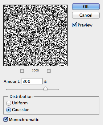
2. With black as the foreground colour: Filter > Noise > Add Noise…

3. Duplicate the (now noisy) background (aka the 1st layer) and rotate it 180°. This becomes the 2nd layer.
4. Again duplicate the 1st layer and flip horizontally. This becomes the 3rd layer.
5. Duplicate the 2nd layer and flip horizontally. This becomes the 4th layer.
6. Save each layer independently as a TIF/LZW image.
Note: From now on, the order of the layers is really not important, but if you still follow me…
7. Open the 1st layer in Fireworks and add a new (empty) state.
8. Open the 2nd Photoshop TIF in Fireworks and drag the image into the empty Fireworks state.
9. Repeat for the remaining two TIFs. The original Fireworks file now has four states.
10. Shift-select all four states in the STATES panel and choose Properties… from the panel’s fly-out menu.
11. Add state delay as shown below:

12. Save as an animated GIF with an adaptive palette, witout dither, no transparency and no image preview, and let the application remove unused colours.
If the randomness is not random enough, do add layers/states but remember that the file size will grow. Animated GIFs work in Siberia if need be, but they are inflexible when compared to the JavaScript/canvas combination.